
The State of New York has a website where you can find data produced by the state. Today I am going to use Pandas to explore a data set for the winning numbers of the New York Lotto. This is a lottery where six numbers are drawn (each between 1 and 59), followed by a bonus draw of a single number (also between 1 and 59).
The data file I have goes from 09/12/2001 to 06/20/2018 and it contains 1750 rows and 4 columns. First, you import Pandas and load the data into a pd.DataFrame:
import pandas as pd

df = pd.read_csv('ny-lotto.csv')
Using .head() gives you a short summary of the first five records. There is a column with the draw date (when the numbers where drawn), a column Winning Numbers with the six winning numbers (as a string), a column Bonus # with the bonus draw, and a column Extra # with an extra draw (which I do not understand).
You can rename some of the columns with .rename:
df = df.rename(columns={'Bonus #': 'Bonus', 'Extra #': 'Extra'})
You can use .describe() to get a short description of the data. Here you learn that, out of the 1750 records, only 339 have a valid value in the Extra column. The statistics are encouraging: the mean value in both the Bonus and Extra column is between 30 and 32. The minimum and maximum values in both columns are 1 and 59, which means that at least these two numbers have been drawn in both cases. In the Bonus column, the first, second, and third quartiles are 15, 30, and 45, which suggests a uniform distribution. In the Extra column, the first, second, and third quartiles are 16.5, 31, and 47.
You can extract the Bonus column as follows:
bonus = pd.DataFrame()
bonus['Bonus'] = df['Bonus']
bonus = bonus.reset_index()
The first line initializes an empty pd.DataFrame. The second line adds a column to bonus from df. The third line adds a column called index. The data in this column can be visualized via
bonus.plot.scatter(x='index', y='Bonus')
Similar steps can be taken with the Extra column:
extra = pd.DataFrame()
extra['Extra'] = df['Extra']
extra = extra.dropna()
extra = extra.reset_index()
extra.plot.scatter(x='index', y='Extra')
Here, the third line drops all of the rows with NaN.
You can use Altair for visualization:
import altair as alt
For example, with the Bonus column you have:
alt.Chart(bonus).mark_circle().encode(
    x='index',
    y='Bonus',
)
I encountered a problem when plotting the data in the Extra column, and solved that problem with the following code:
alt.Chart(extra).mark_circle().encode(
    x=alt.X(
        field='index',
        type='quantitative',
        scale=alt.Scale(zero=False),
    ),
    y='Extra',
)
You get the following two graphs:

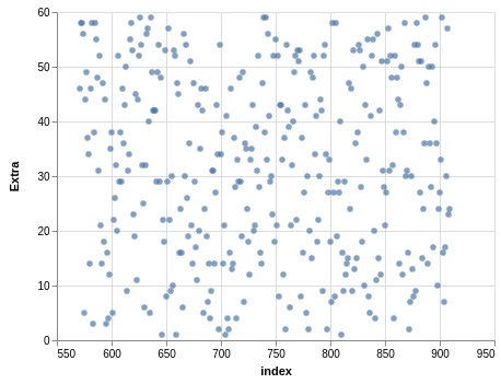
As you can tell, these scatter plots appear to be uniformly distributed, which is what you would expect for a fair lottery.
Another visualization tool is Seaborn. You can use Seaborn to great scatter plots with histograms:
import seaborn as sns

sns.jointplot(
    x='index',
    y='Bonus',
    data=bonus,
)

sns.jointplot(
    x='index',
    y='Extra',
    data=extra,
)
Again, these histograms show that the distribution is almost uniform. In a future post I will look at the winning numbers.